GigFuse
Connecting local talent with live events.
Designing a connected marketplace experience where artists can showcase their work, discover opportunities, and connect with event organizers.
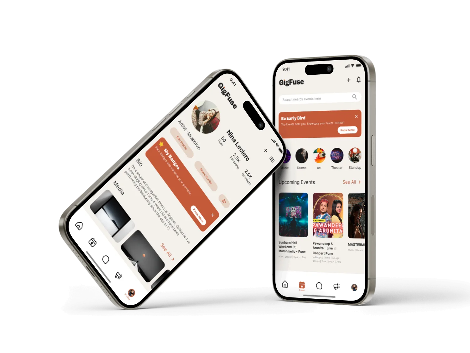
A simpler way to connect talent and opportunity
GigFuse is a digital platform that connects artists with event organizers through a more structured hiring journey. Instead of relying on scattered searches, referrals and informal communication, the experience brings discovery, profiles, communication, reviews and booking-related interactions together.
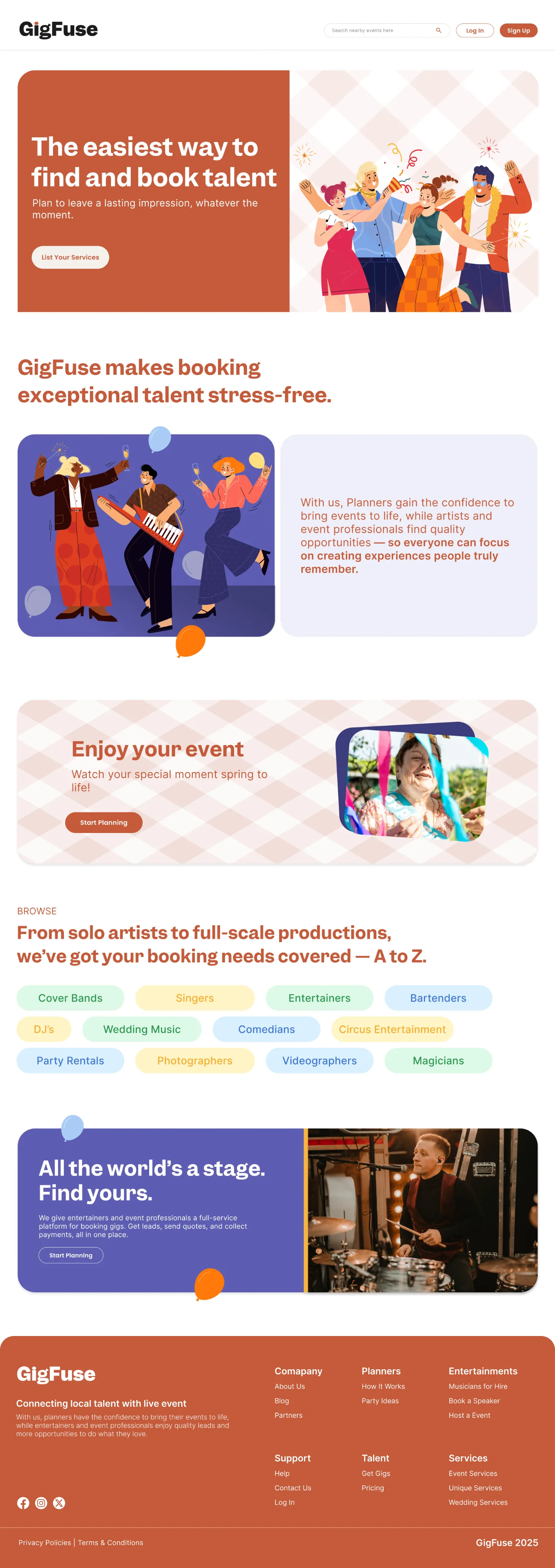
The problem
Finding the right artist for an event can be fragmented for both sides. Artists need a clear way to present their work and find relevant gigs, while organizers need enough information and trust signals to confidently evaluate and contact talent.
For artists
Discover relevant gigs, present skills and experience, communicate with organizers, and build credibility.
For organizers
Find suitable talent faster, evaluate profiles and reviews, communicate requirements, and manage hiring.
Designing around the complete hiring journey
The goal was not simply to create a directory of artists. The product needed to support the moments between discovery and a successful connection.
Solution
Search & Discovery
Help users explore artists, gigs and opportunities through focused discovery and categories.
Artist Profiles
Give artists a strong space to showcase identity, skills, experience and work.
Hiring & Communication
Support conversations around requirements, expectations and bookings.
Ratings & Reviews
Use social proof to reduce uncertainty and support more confident decisions.
Notifications & Alerts
Keep users informed about opportunities, messages, bookings and activity.
Payments & Billing
Bring payment-related interactions into the product for a more structured experience.
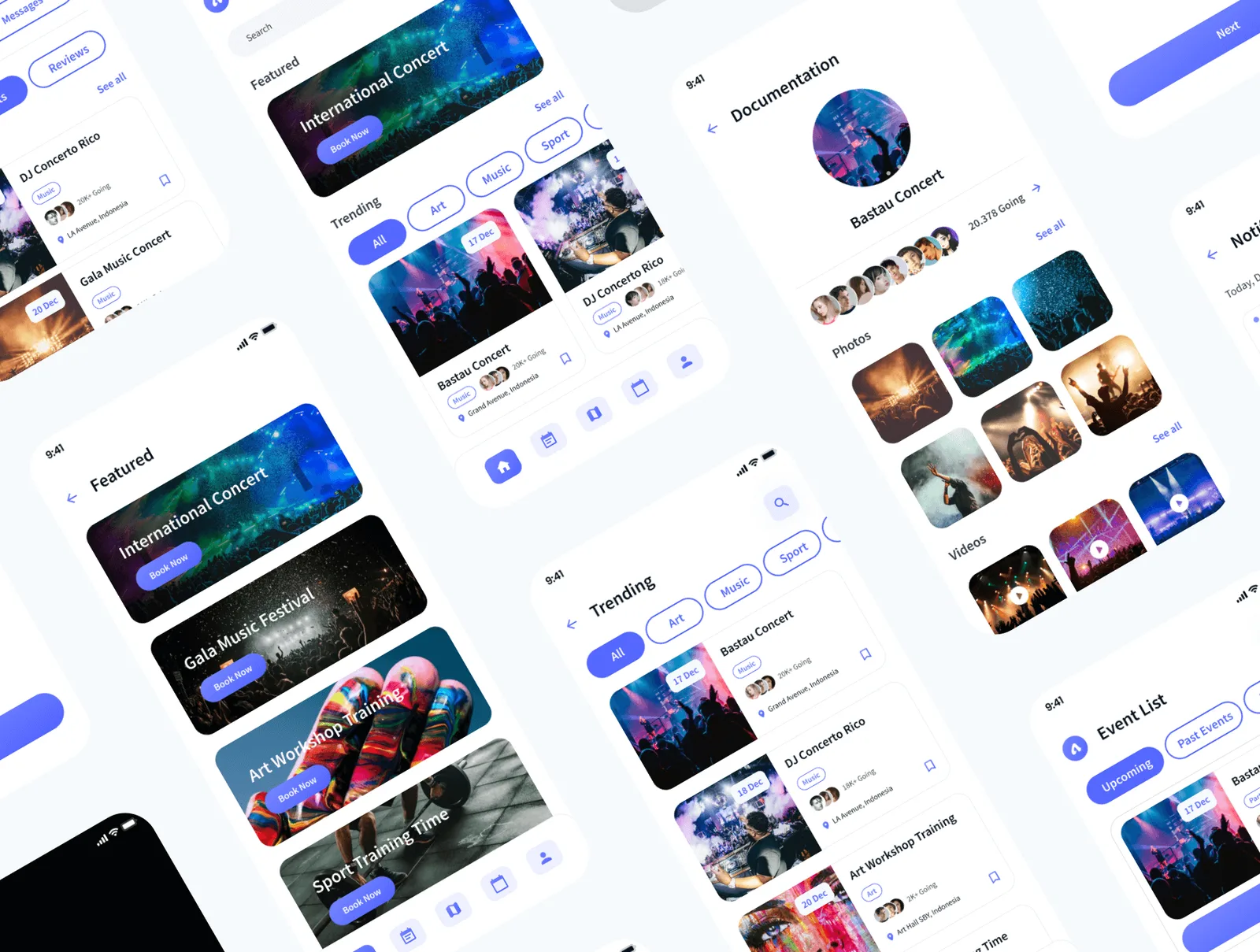
From user needs to a connected experience
I approached GigFuse as a two-sided marketplace problem, mapping the needs of artists and event organizers before translating them into the product flow.
Discover
Understand the two user groups, their goals and the points where their journeys meet.
Define
Frame the core journey around discovery, evaluation, connection and hiring.
Ideate
Explore information architecture, navigation, profile presentation and key interaction patterns.
Design
Translate the selected directions into mobile and web interfaces with a consistent visual language.
Test
Review the core flows for clarity and friction, then refine hierarchy and interaction details.
Key experience decisions
Discovery before complexity
Let users begin exploring without needing to understand the entire platform first.
Profiles as decision tools
A profile should answer the questions an organizer needs before starting a conversation.
Trust inside the flow
Profiles, reviews, communication and payment-related interactions work together to reduce uncertainty.
One connected journey
Discovery, communication, booking and payment are treated as one experience rather than isolated features.
Making the first interaction feel approachable
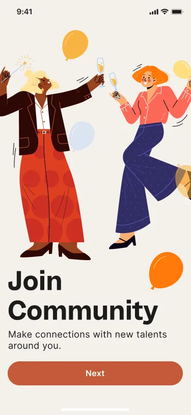
The onboarding experience introduces GigFuse through a short sequence: establish the user's role, create an account, and collect information needed to make future discovery more relevant.
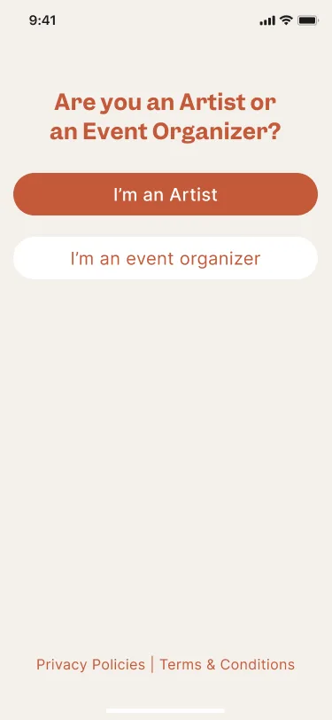
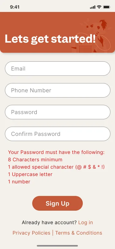
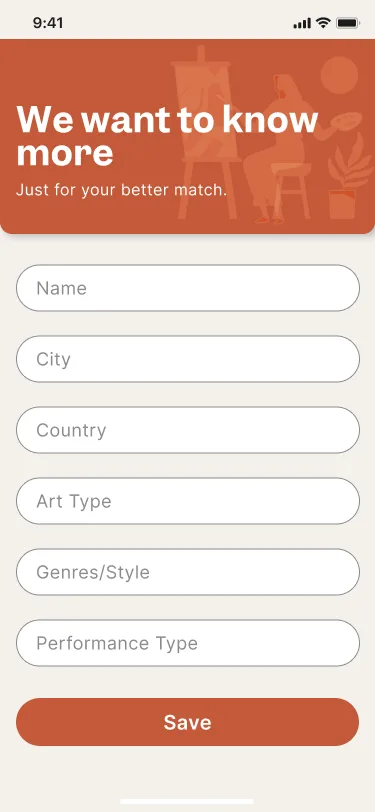
Role-first entry
The artist / event-organizer choice immediately establishes the user's context.
Progressive information
Details are collected in manageable steps rather than presented as one large form.
Relevant matching
Profile information such as city, art type, genre and performance type can improve future relevance.
Turning discovery into a visual, scannable experience
The product uses visual content, categories and event cards to help users scan opportunities quickly while keeping important information close to the decision point.
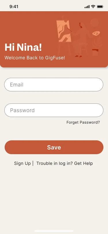
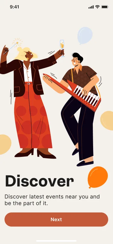

Visual language
The interface uses a warm orange-led palette, generous spacing, large imagery and rounded components. This creates a friendly marketplace tone while maintaining clear hierarchy across discovery and profile-led screens.
The outcome
GigFuse evolved from a simple idea of “finding artists” into a more complete marketplace experience built around discovery, trust, communication and hiring.
What I learned
Designing GigFuse reinforced the importance of thinking beyond individual screens and treating marketplace UX as an interconnected system.
The key insight was that marketplace design is fundamentally about reducing uncertainty. Search helps users find options, but profiles, reviews, communication and reliable transaction flows help them make decisions.
Good marketplace design doesn't just help users find each other — it helps them feel confident enough to connect.