Medicare
Designing a simpler interaction for recurring medicine refills.
A mobile app concept for recurring prescription management and medicine reordering.
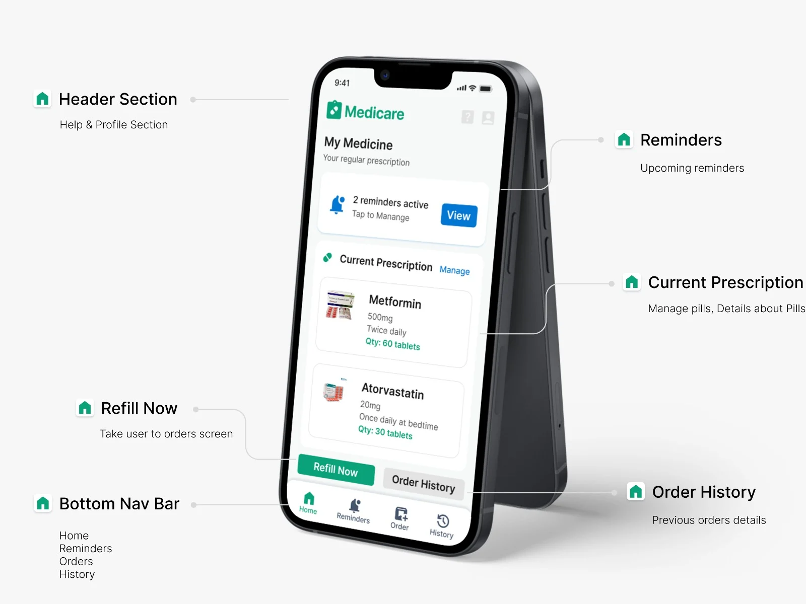
An easy-to-use app for monthly medicine reordering
Medicare is a mobile healthcare experience designed around a recurring task: ordering medicines that users already know they need.
For people managing chronic conditions, prescriptions can remain unchanged for long periods. Yet every month, users may still have to search for medicines, select quantities, manage prescriptions, and complete the same ordering process again.
Instead of treating every order as a new purchase, Medicare explores how an interface can remember, simplify, and support a task that users already understand.
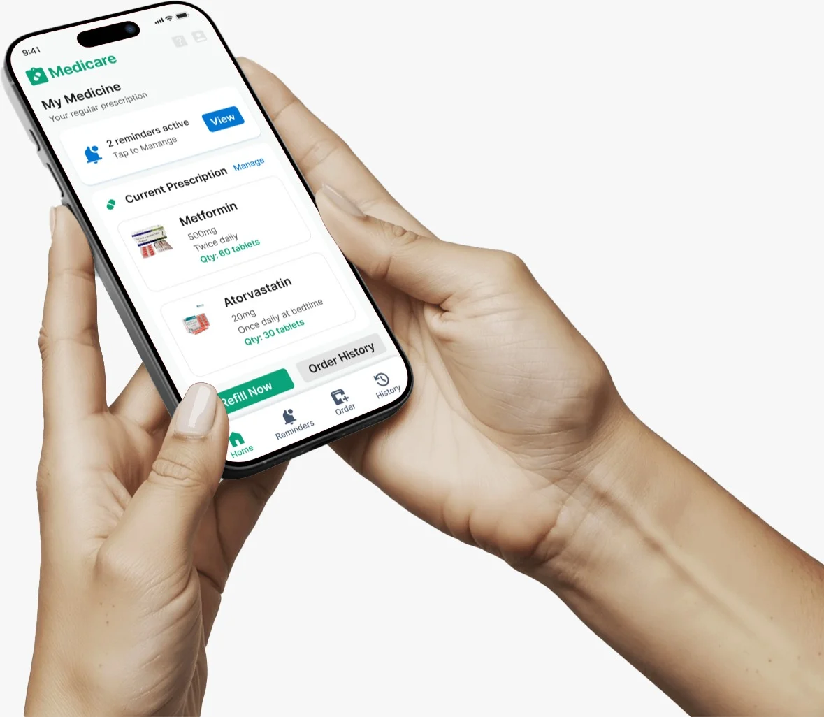
The problem is not ordering medicine. It is repeatedly performing the same interaction.
Most users are elderly and not very tech-savvy. Their prescriptions rarely change; they usually reorder the same medicines monthly. Yet the conventional online ordering process can require users to repeatedly navigate through multiple screens and decisions.
Users may experience
- Complex interfaces and multiple steps
- Small text and unclear visual hierarchy
- Difficulty remembering refill dates
- Fear of selecting the wrong medicine or quantity
- Difficulty managing prescription changes
- Uncertainty about whether an order was placed correctly
How might we make recurring medicine reordering easier for users who already know what medicine they need, without forcing them through the same complex ordering process every month?
This shifted the design challenge from building another medicine-ordering app to understanding how the interaction could better support a familiar, recurring task.
Primary users
The primary users are older adults and chronic-care users who regularly purchase prescription medicines. Their needs are different from those of a first-time medicine shopper. They often:
Reorder familiar medicines
Follow relatively stable prescriptions
Prefer predictable interactions
Need clear confirmation before an important action
May have lower confidence using digital products
Benefit from reminders rather than memory
A recurring user's mental model
The user is often not thinking: “Which medicine should I buy?” They are thinking:
“I need the medicines I normally take.”
This distinction became important in shaping the interaction.
My role
I worked across the interaction-design process, from understanding the recurring medicine-ordering problem to exploring flows, structuring information, designing the interface, establishing the design system, and refining the experience through usability review.
My contribution included
- Understanding recurring medicine-ordering behaviour
- Identifying interaction and usability pain points
- Structuring the information architecture
- Mapping key user flows
- Exploring wireframes and interaction alternatives
- Designing the mobile interface
- Creating the Medicare design system
- Applying accessibility considerations
- Reviewing and iterating on key interactions
- Designing the final high-fidelity experience
Understanding the recurring task
I focused on understanding where users experience friction while managing medicines digitally. Rather than looking only at the visual interface, I looked at the broader interaction around:
Three areas became particularly important:
Monthly reordering
Users may repeatedly purchase the same medicines, but the interaction often treats each purchase as a new transaction.
Medication reminders
Users may need to remember both when to take medicines and when medicines need to be reordered.
Digital confidence
A small interaction problem — an unclear button, unfamiliar terminology, or missing confirmation — can create disproportionate anxiety.
What I learned
Familiarity is more valuable than exploration
Recurring users don't need more ways to discover medicines — they need a predictable way to access the ones they already know. This led to a stronger emphasis on previous medicines, current prescriptions, order history and refill actions.
Users want reassurance, not just functionality
An incorrect selection feels more serious than an ordinary shopping mistake, so users need clear confirmation at important points. This shaped action hierarchy, confirmation states, order summaries and simple language.
Remembering should not be the user's responsibility
Instead of expecting users to remember every date, the system supports them through reminders and refill prompts.
Fewer decisions can create more confidence
For a low-confidence user, every additional choice is another opportunity for uncertainty.
The more familiar the task, the less interaction the user should have to repeat.
From “placing an order” to “repeating a known task”
The research changed how I approached the main ordering interaction.
But a returning user may already know which medicines they need, which prescription they follow, and what they ordered previously. So I explored a different interaction model:
Which interactions can be removed because the system already knows something about the user's previous behaviour?
Mapping the experience
Before moving into high-fidelity screens, I mapped the major areas of the experience.
Core information architecture
Home
- Current Prescription
- My Medicines
- Refill Now
- Upcoming Reminders
Reminders
- Upcoming Reminders
- Add Reminder
- Manage Reminder
Orders
- Current Orders
- Order History
Prescription
- Current Prescription
- Manage Prescription
- Add / Delete Medicine
Profile
- Manage Profile
- Caregiver Details
- Help
Key routes explored
Rather than forcing users to begin with search, the interface creates direct paths to the information they are most likely to need. The question: what should a returning user see first?
Wireframe exploration
Early exploration focused on information hierarchy, placement of recurring actions, navigation structure, medicine information density, primary versus secondary actions, confirmation points, and the number of steps required to complete recurring tasks.
What information does the user need at each moment, and what can the system remove from the interaction?
Design decisions
| Decision | Problem | Why |
|---|---|---|
| 01 · Make recurring actions immediately accessible — Refill Now, My Medicines and Reminders are surfaced prominently. | A returning user shouldn't have to navigate the entire product to repeat a familiar task. | The interface should reflect the user's most frequent behaviour rather than treating every feature as equally important. |
| 02 · Treat previous medicine information as a shortcut — previous/current medicines become part of the primary experience. | Repeatedly searching for the same medicines adds unnecessary interaction. | Instead of “What medicine are you looking for?”, the system says “Here are the medicines you usually manage.” |
| 03 · Separate medication management from ordering — My Medicines, Manage Prescription, Reminders and Orders are distinct. | Medicines are not only products to purchase; users also manage prescriptions and reminders. | Clearer mental models for different tasks instead of one overloaded flow. |
| 04 · Use reminders as proactive support — add reminders with a single action and view upcoming ones. | Users should not have to remember every refill date manually. | Moves from “come back when you remember” to “the system helps you remember.” |
| 05 · Make important actions visually unambiguous — primary actions are distinct; secondary ones recede. | Low digital confidence can make unclear actions intimidating. | Strong hierarchy reduces the decisions users make before knowing what to do next. |
| 06 · Confirmation is part of the interaction — important actions get clear feedback. | Users may worry they chose the wrong medicine or that an order didn't go through. | In healthcare, reassurance is not visual polish. It is part of usability. |
Designing for clarity before decoration
The Medicare design system was created to maintain consistency across the product while supporting users with lower digital confidence.

Typography
Legible type sizes and clear hierarchy to improve scanning and readability.
Colour
Calm, healthcare-oriented colours to communicate trust and reduce visual intensity.
Spacing
Generous spacing separates information and actions, reducing visual clutter.
Components
Buttons, cards, forms, navigation and feedback states follow consistent patterns, so users learn once and reuse.
Accessibility considerations
Accessibility was treated as an interaction requirement rather than a visual afterthought.
- Larger, readable text
- Clear contrast
- Adequate touch-target size
- Simple language
- Consistent navigation
- Clear primary actions
- Sufficient spacing between interactive elements
- Confirmation feedback for important actions
If an interaction requires the user to stop and wonder what happens next, the interface has more work to do.
Testing the interaction, not just the interface
The designs were reviewed through informal usability checks and self-evaluation against accessibility and elderly-usability considerations.
Can a returning user find their medicines quickly?
Can they initiate a refill without unnecessary steps?
Can they create and understand a medicine reminder?
Can they tell whether an important action succeeded?
What changed after evaluation
- Reduced unnecessary steps
- Strengthened button visibility
- Simplified confirmation messages
- Improved information hierarchy
- Made recurring actions easier to discover
Before
More interaction and more competing information.
After
A clearer hierarchy with stronger emphasis on the user's immediate task.
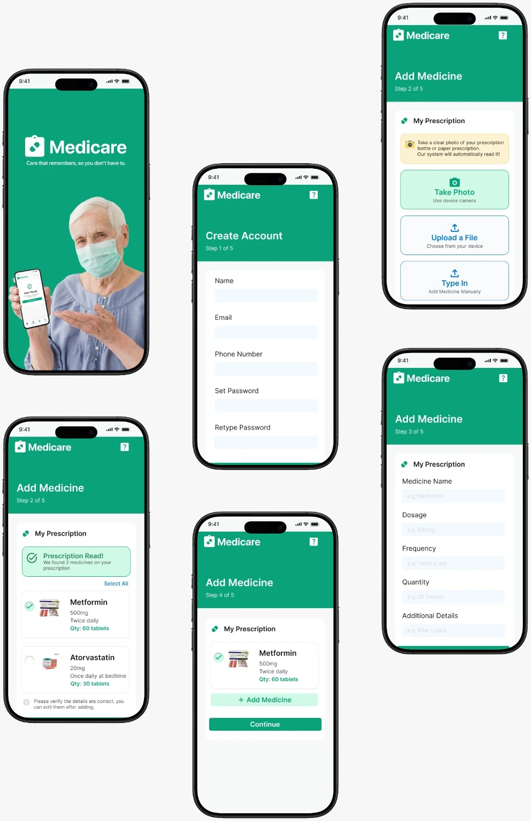
The recurring refill journey
Home
Quick access to medicines, reminders, prescription and refill actions.
My Medicines
Previously managed medicines are available without starting from search.
Refill Now
The user initiates the recurring task directly.
Review
Medicines and order information are presented clearly before confirmation.
Checkout
The transaction completes with minimal unnecessary interaction.
Confirmation
A clear completion state reassures the user the order is placed.
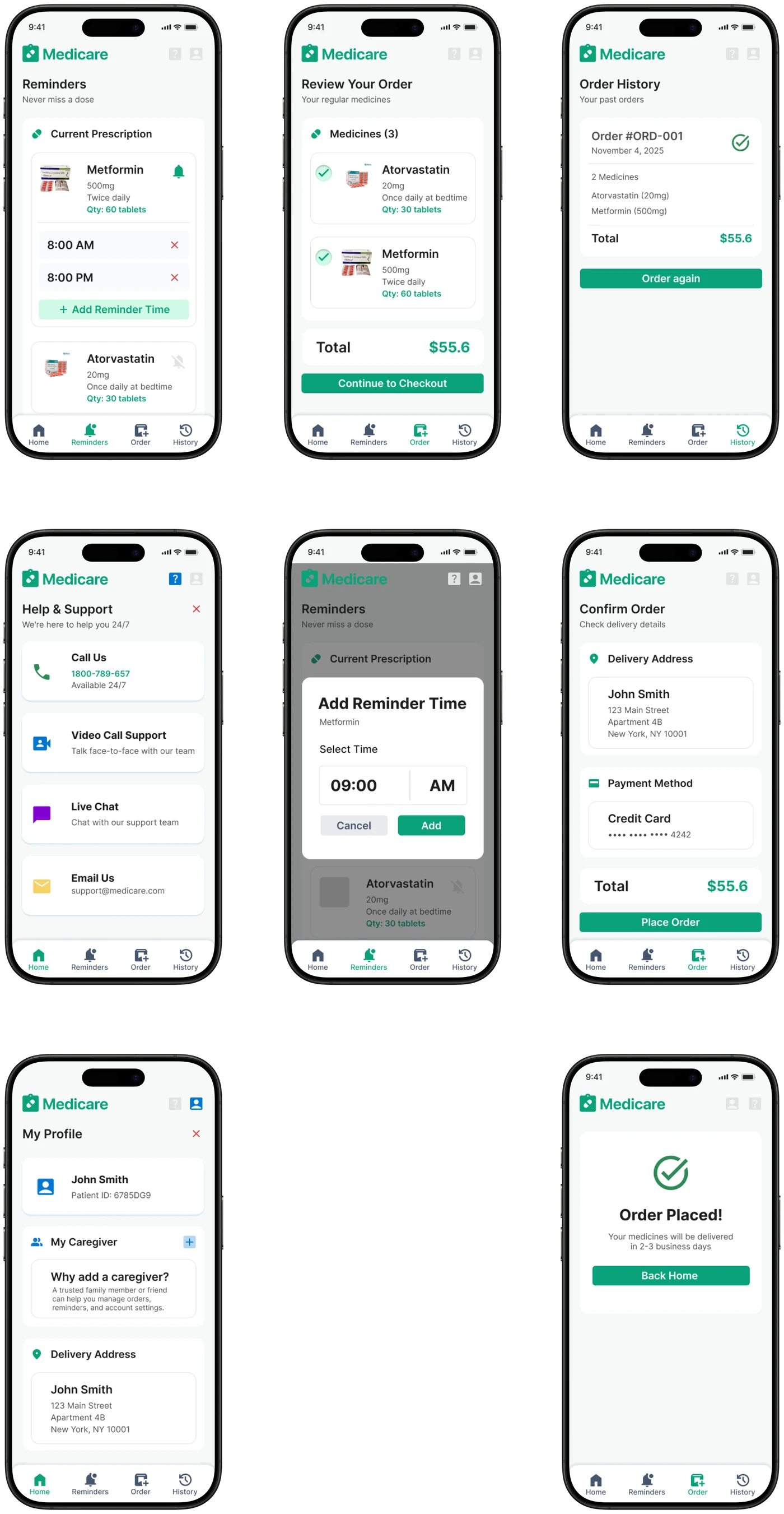
Supporting interactions
What I learned
Medicare changed how I think about simplicity in interaction design. I initially approached the problem as: How can I make online medicine ordering easier? But the more important question became: Does the user need to perform all of these interactions again in the first place?
For recurring tasks, the best experience may not be a faster version of the existing process. It may be an interaction that remembers what the user already knows and removes unnecessary decisions.
This project also made me think about accessibility beyond font sizes and colour contrast. For users with lower digital confidence, accessibility is closely connected to predictability, feedback, hierarchy, and confidence.
Good interaction design is not about adding more assistance. Sometimes it is about removing the interactions users never needed to perform.